If you've ever opted in for an online training or a gift from an entrepreneur or author (such as a mini-course or a book), then you've seen and used an opt-in page.
Just in case you're not familiar with the terminology, an opt-in page is a web page that collects your contact information (usually your email address) in exchange for a gift from the person who owns the page.
As a business owner, what's the point of giving away your knowledge? The answer is at once simple and powerful: to add community members to your email list. And why is that so important? Because when you have an email list—which you control, as opposed to a social media following—you can more easily grow a successful, profitable business by staying in contact with the people on it.
Most online entrepreneurs have already developed a variety of gifts and accompanying opt-in pages. And if you're one of them, then you know that the better your opt-in pages convert (the higher the percentage of people who see the page AND give you their contact information to collect your freebie), the greater number of people you add to your email list.
(Here's a quick example of conversion: if 200 people visit your opt-in page and 180 of them give you their email address, your conversion rate is 90%.)
Several different factors affect conversion, including:
- Whether your traffic is warm or cold—in other words, whether the people seeing your page already know you or not. In the industry, we refer to people who have never heard of you as “cold” traffic or leads, and the people who have heard of you as “warmer” traffic or leads, who have likely been referred to you or who have seen you somewhere else—social media, online, etc.
- How effective your leads believe your gift will be at solving a specific problem they have.
- The opt-in page itself, in terms of copy and layout. That's what we're going to talk about today.
In general, opt-in pages include the following elements:
- Headline
- Graphic
- Bullet points
The Headline
As the first thing people see, your headline must grab readers' attention and, of course, proclaim the value of your gift. That's why I often use the title of my gift as the headline for its opt-in page. The title of your free gift should be so powerful, you WANT to use it as a headline.
The whole point of your gift is to give prospects a taste of what you have to offer, right? So naturally, it should be something they believe is worth giving you their email address for. The title should show them that it is!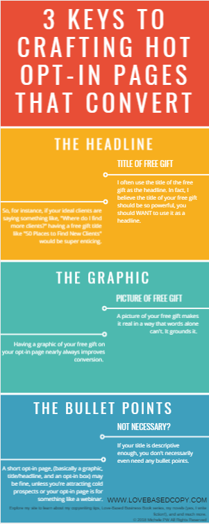
Here are some tips for creating a great title:
Be specific!
Use your title to clearly, specifically talk about a problem that's keeping your ideal client up at night.Here's an example: Let's say you're a chiropractor, and your ideal clients lose sleep because they have back pain. If the title of your gift is something like, “4 Tips You Can Implement TODAY to Reduce Your Back Pain Immediately,” your ideal clients would likely find it enticing.
The title should NOT focus on the HOW—your solution. Sticking with the scenario above, you might be making a mistake if your title said something like: Feel Better: Lose Weight, Stretch, Do Yoga, and Drink More Water.
The ideal prospects of a chiropractor aren't losing sleep because they want to lose weight, stretch, do yoga, and drink water.
A better title would be, the one I mentioned above: “4 Tips You Can Implement TODAY to Reduce Your Back Pain Immediately.”
See how that one highlights the problem but doesn’t reveal the how?
The Graphic
I've seen hundreds (if not thousands) of opt-in pages, and there's one thing I've noticed: including a graphic of your gift almost always improves your page's conversions.
Now more than ever, though, graphics are a must, as images dominate the Internet (think about it: Intstagram and Pinterest are image-driven).
An image of your gift grounds it, making it real in a way that's different from words on a page.
The Bullet Points
Before we dive in to bullet points, one quick disclaimer: if your title is catchy and descriptive enough, you may not even need bullet points; a graphic, title/headline, and opt-in form can work great.
Here's a real-life example: One of my best-performing opt-in pages is for a free Love-Based Copy Template. The page includes a graphic, the words, “Free Template” above the template title, and the words, “Just enter your name and email address for instant access.”
However, if you believe more copy and greater detail will enhance the readers' understanding of your gift, you might consider adding bullet points.
One suggestion to add here: if you plan to send cold traffic to your opt-in page (from Facebook ads, for instance), OR, if it's an opt-in page for a live training (like a webinar), definitely add bullet points. When it comes to cold traffic, bullet points will make your gift even more enticing to people with whom you've established that know, like, trust factor. And for live trainings, you're asking people to spend their time with you.
So how do you create bullet points that inspire people to take action? It's an art form. I have more resources here and here to help.
If you'd like an opportunity to sharpen your copywriting skills, which play a role in improving your opt-in conversions, you may want to check out my love-based copywriting books below!
- Getting People to Take Action: Persuasion Through Love, Rather Than Fear - December 27, 2018
- The 3 Elements on Every High-Converting Opt-in Page—and How to Use Them - November 5, 2018
